The first module for Colour Management has asked us to explore colour management and workflow tools to improve colour management and monitor calibration.
Activity 1.1: Research colour management tools
Two leading brands that provide colour management tools for photographers are X-Rite and Datacolor.
- X-Rite https://xritephoto.com/
- Datacolor https://www.datacolor.com/
Have a look at their websites and see which products you can find that would be helpful for colour-managing a photographer’s workflow.
The Results
After looking at both websites and reading extensively about the products from both companies both have external colour calibration technology utilising colorimeters and calibration software enabling true colour management and even adjustments for changes of ambient light n the room.
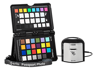
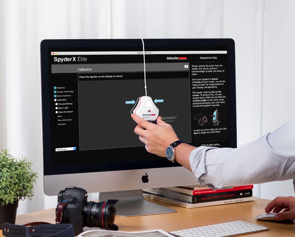
Out of the two the The SpyderX has several models ranging from from $169.99 to $499.99 dependant on features and output volumes and is simpler to purchase with an online store so for practical reasons and ease of purchase this one would be my pick of the two, as information was easier to find on the web without having to check youtube tutorials and try and rack down a dealer as with the X-rite. At this point in time having upgraded from a laptop to an iMac the world of colour difference between the two platforms from Windows to Mac OS and colour calibration profiles on the mac I’ve actually re-edited some images i was previously happy with as the colours were not quite right. I will definitely look into the Spyder x to keep my colour workflow as it should be. Coming from a photofinishing and printing back ground I understand colour profiles and the difference between what can be printed and what can be see by the eye or represented on a screen and how to profile a printer but first of all your monitor needs to be calibrated right before you even get to that step.
Activity 1.2: Explore colour spaces and their differences using Mac’s ColorSync Utility
Using Mac’s ColorSync Utility app, compare different colour spaces, including:
- sRGB
- Adobe RGB (1998)
- CMYK
What do you notice about each? How do they compare with one another? Record your thoughts on your process blog
The Results
The first thing i did after purchasing my Mac was to calibrate the screen, as it’s primarily for my photography
I noticed the difference immediately going from a 15 inch Lenovo laptop display (which try as you might is virtually impossible to calibrate ) to a 27 inch iMac how much more vibrant and truer colour looks and also how intuitive adobe programs are to the MAC OS X and how simple it is to calibrate the monitor by going to settings/display and clicking on the colour tab.

I played around with the various colour spaces before deciding to work in Adobe RGB (1998)
CYMK or Cyan,Yellow Magenta and Black gives you a representation of way many fewer colours available but it’s handy if your printer uses CYMK, however this can be accounted for in printer profiles in Adobe Lightroom and Photoshop when soft proofing work so you get an accurate translation for printing to whatever brand of printer your printing to. Theres a lot less available colours so it was much more muted.
sRGB gives you almost as many colours as Adobe and most windows monitors are calibrated for it. The colours weren’t quite as true and seemed to be a little more saturated than the Abode RGB
