Story Telling

Activity 2.1: Photo essay aesthetic

Find and share an aesthetic style example for your photo essay. What do you like about this style?

Activity 2.2: Photo essay subject research

Find and share a photo story from industry created on a subject similar to yours. Discuss the style/success of the approach used.

Activity 2.3: Process blog

Post the results from the above activities, along with a brief summary of what you’ve learned and any challenges you faced in Module 2: How to find and build a story, on your process blog. When completed, post a link to your blog on the Discussion Forum on the Blackboard LMS portal.

Activity 2.1: Photo essay aesthetic

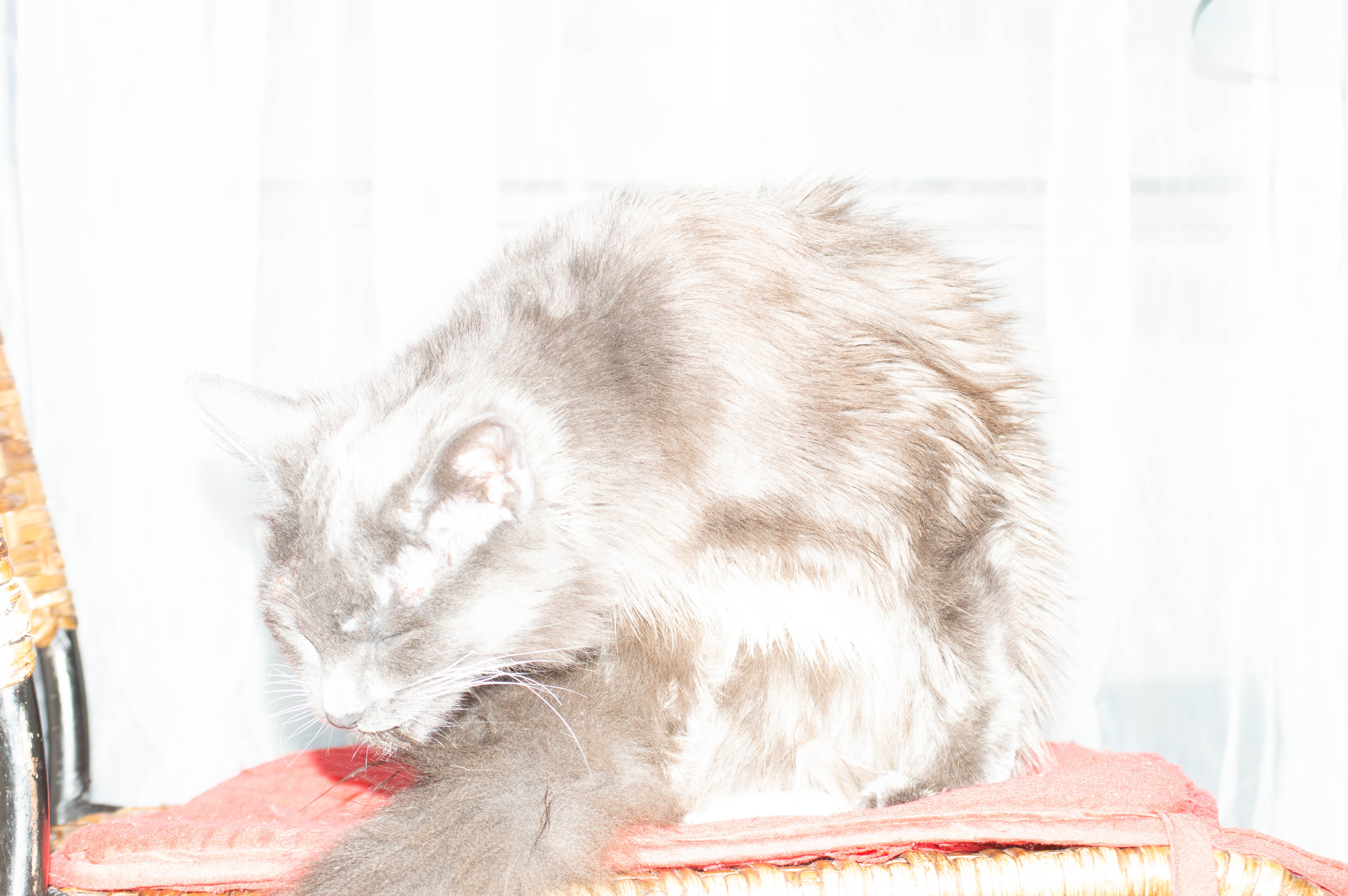
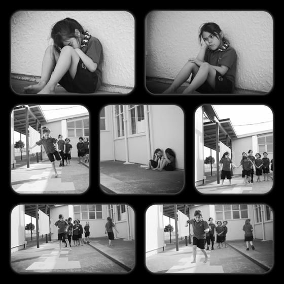
I’ve been trawling the web for layouts and ideas that appeal to me. I really liked some work i found on Pinterest called Finding Friendship https://www.pinterest.com.au/pin/843299098961152628/ as pictured below, the asthetic appeals to me and relates in that it’s a child’s day/life and my photo essay is about my daughter. With this piece it’s about feeling lonely and wanting friends and joining into play the narrative is simple to understand in the flow of images in the layout.

Activity 2.2: Photo essay subject research

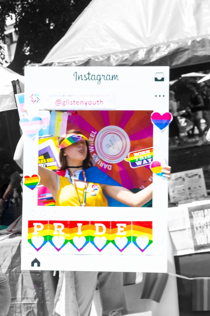
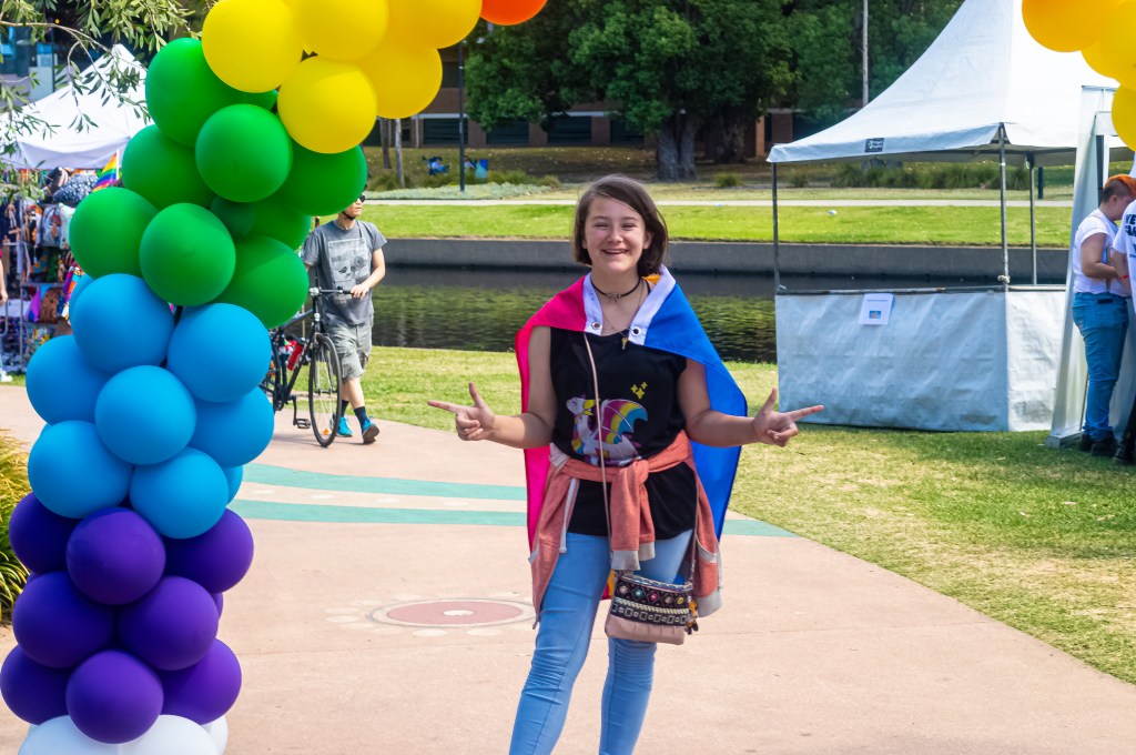
There’s a wealth of photo essays on pride and Gay family’s on the world wide web.

I found some great ones including :-

https://prezi.com/p/6pr6ahao7bqb/photo-essay-lgbtq-rights/

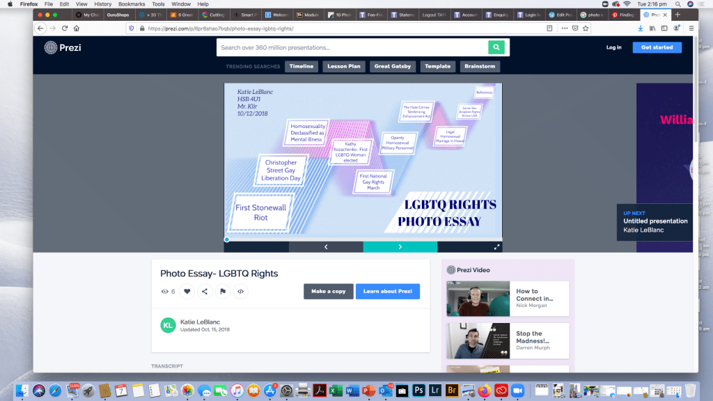
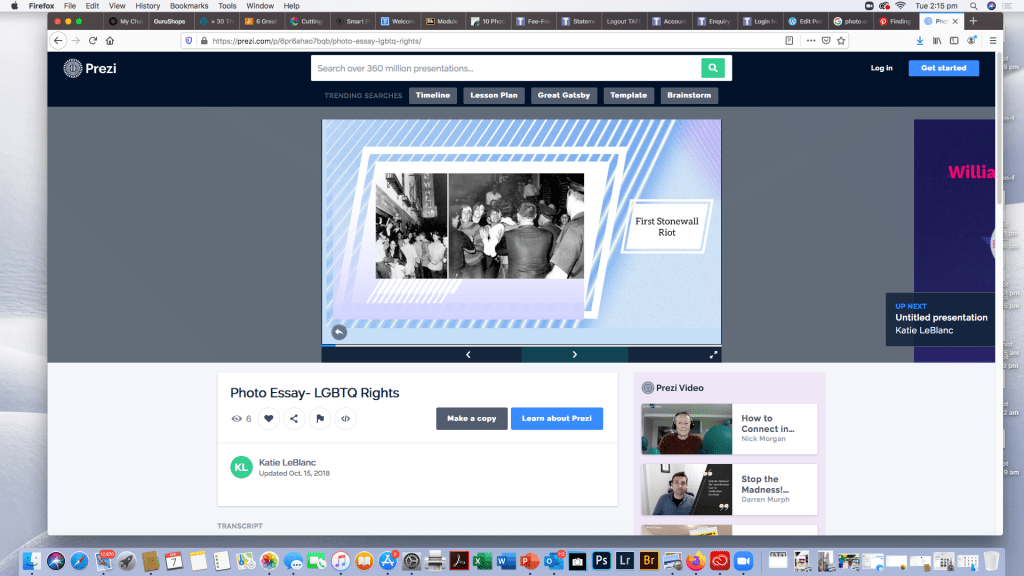
it’s quite interactive every time you click the arrow it takes you to a different plot point and opens a photo and then another captioned one, not the visual style i was going for but engaging none the less.

For this part of the exercise and just in my general research over the last few months I’ve fallen in love with this site:-

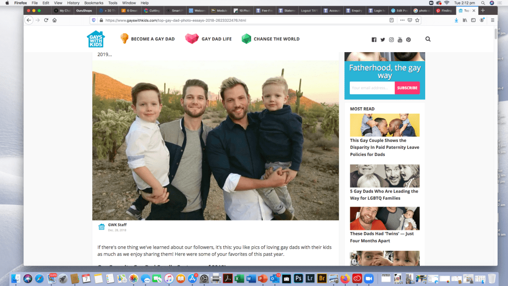
https://www.gayswithkids.com/top-gay-dad-photo-essays-2018-2623322476.html

it’s a family aesthetic but geared very strongly towards Gay Dads. The kids are just adorable.

Activity 2.3: Reflections

There’s some brilliant work out there and i often find my self looking at pictures and not doing my work While I’m still attached to NAT GEO at this point I’m researching other online publications that may be interested in my essay.

Media and Documentary – A Photo Essay

Activity 1.1: Photo Essay Ideas

After familiarising yourself with a range of photo essays from industry, write down 2 of your own photo essay ideas on you process blog. Provide feedback on your classmates’ thoughts on the discussion forum, which you can access via the link at the bottom of the page or in the left-hand navigation menu.

Activity 1.2: Photo essay story angle

Based on feedback from your classmates and lecturer, choose your most robust essay idea and develop a story angle by brainstorming the subtopics within your story idea.

Activity 1.3: Process blog

Post the results from the above activities, along with a brief reflection, on your process blog. Make sure to include thoughts on what you learned, along with the challenges you faced. When completed, post a link to your blog post on the Discussion Forum on the Blackboard LMS portal.

Activity 1.1: Photo Essay Ideas

Photoshoppeed edit of Glisten youth Pride Instagram Frame

As you can see from my image, my idea started forming Last October when my daughter announced she was Pan sexual. Being Bisexual myself it wasn’t a great revelation but I did need to research what Pan-sexuality was. This particular photo was taken in February on Mardi Gras Fair Day 2020 on Sydney.

Pansexuality is defined on Wikipedia as “Pansexuality, or omnisexuality, is the sexual, romantic or emotional attraction towards people regardless of their sex or gender identity. Pan sexual people may refer to themselves as gender-blind, asserting that gender and sex are not determining factors in their romantic or sexual attraction to others.”

My initial thought was National Geographic but I’m researching pitches to LGTBQI publications as well.

Activity 1.2: Photo essay story angle

My idea to document her journey from My little girl to Baby Gay started when we attended her first local pride day in November at Parramatta Riverside Park, and when i knew we were doing Media and documentary for first trimester, i slowly began over the summer holidays to think about how i could make a cohesive story out of this life event. Other thoughts had been to do a day at Hospital with her as she has chemotherapy for Crohns Disease and Rheumatoid arthritis every 8 weeks for the last 3 years, she was diagnosed at 9 years old with Severe fistulating Crohns and gets ulcers from her mouth to her anus through her entire GI tract. The rheumatoid was diagnosed as an additional Auto Immune disease late last year, around the time she came out as Pansexual. Her cousin also has Crohns and Cystic Fibrosis is being investigated for her. Auto Immune diseases often come in multiple disorders, but i wanted something uplifting and colorful that represents my daughter, shes not a disease or a disability or a sexuality she was Simply BORN THIS WAY which is the title I’m working with.

Parramatta Pride Fair Day 10th October 2019 Coming out Day

Activity 1.3: Process blog – Reflections

My thoughts so far…..how do i distill over 900 images so far into a 10-25 image photo essay……what is my exact narrative..do i include hospital photos too?

After tossing ideas around in class i felt somewhat clearer that my idea was a great one but i was still left with the dilemma of how to tell her story. That’s my goal over the next 12 weeks… to tell Stella’s story and have it be authentic to her and how she was BORN THIS WAY!

Module 4

Adjusting Tone and Contrast in Lightroom

This weeks task is to edit a series of RAW images (sometimes refered to as Digital Negatives images strait out of the DSLR camera containing all the sensor information as well as metadata etc and a non lossy format perfect for editing)

I use a Nikon D3200 24MP camera for the majority of my work at the moment, it’s not too heavy and a great little camera, so my RAW files are in the NEF format which is Nikon’s RAW file format.

The RAW images i will be processing in this exercise were taken before i fractured my pelvis at The Chinese Gardens in Darling Harbour in Sydney early February and will form part of assignment 2 for digital imaging. (……no i didn’t fracture it in a fall at the gardens in the wet…it was an incident with an air conditioner, a cat , an iMac that now has a cracked glass screen and broken LED and a bed side storage box…..the cat suffered no injuries and continues to life a spoilt happy life and a comsol cable constant data back up to the cloud and a spare monitor from my sons room mean i can resume working…..)

All images will be edited in Adobe Lightroom Classic and I will screen shot my process as I edit each of the 3 images I’ve chosen for this exercise.

Image 1

Waterfall – Chinese Gardens Of Happiness

This is the raw image strait out of the camera with no editing and as you can see from the meta data it’s a long exposure of 1.1 sec focal length 34mm on an 18-55mm kit lens with an ISO of 100 i also used a ND filter as i was shooting during the day. The next series of images will demonstrate the use of the sliders in adjusting the contrast and overall tone and colour corrections in the image as well as image sharpening and any noise reduction.

Image 2

Window – Chinese Gardens of Happiness

I’ve added my copyright details to the Metadata and i really love this shot as the shape of the window opening in the wall was just such an interesting asymmetrical shape. This was also another long exposure to try and bring a softer tome to the wall and it was quite dark as t was a cloudy rainy day. The exposure was 6.2 seconds at 55mm f25on the 18-55mm kit lens no ND filter as it was inside a corridor with an ISO of 100

Image 3

A Different Angle on the waterfall

I zoomed in to get a different angle on the waterfall in this shot. Long exposure once again 4.0 sec at f25, focal length was 24mm using 18-55mm kit lens with an ND filter and ISO 100

Reflection

I love landscape photography, so i probably have over 100 unedited waterfalls from my travels, but i took this set in February with this module and the assignment in mind.

Normally when editing landscapes or other types of photos i have presets i would use for waterfalls, night shots of cityscapes etc and i would apply that when I’m adding my copyright to the metadata in the library and then do any additional adjustments to the tone curve if needed.

I quite enjoyed the exercise in demonstrating the steps i take when editing and the subtle differences between the colours and tones is apparent from the screen shots. Editing ones work is a highly personal choice what i like in an image someone else may do differently, I like vibrant colours and soft but sharp images with lots of clarity. I love Lightroom for that reason because it’s non destructive meaning once I’ve saved this edit I can reset it to original raw data and try another preset or create a preset or even make it black and white. The endless possibilities for creating a final image in Lightroom make it an invaluable tool and an essential part of a photographer work flow.

Introduction to Colour Management

The first module for Colour Management has asked us to explore colour management and workflow tools to improve colour management and monitor calibration.

Activity 1.1: Research colour management tools

Two leading brands that provide colour management tools for photographers are X-Rite and Datacolor.

Have a look at their websites and see which products you can find that would be helpful for colour-managing a photographer’s workflow.

The Results

After looking at both websites and reading extensively about the products from both companies both have external colour calibration technology utilising colorimeters and calibration software enabling true colour management and even adjustments for changes of ambient light n the room.

X-rite Colour Management
Datacolor SpyderX

Out of the two the The SpyderX has several models ranging from from $169.99 to $499.99 dependant on features and output volumes and is simpler to purchase with an online store so for practical reasons and ease of purchase this one would be my pick of the two, as information was easier to find on the web without having to check youtube tutorials and try and rack down a dealer as with the X-rite. At this point in time having upgraded from a laptop to an iMac the world of colour difference between the two platforms from Windows to Mac OS and colour calibration profiles on the mac I’ve actually re-edited some images i was previously happy with as the colours were not quite right. I will definitely look into the Spyder x to keep my colour workflow as it should be. Coming from a photofinishing and printing back ground I understand colour profiles and the difference between what can be printed and what can be see by the eye or represented on a screen and how to profile a printer but first of all your monitor needs to be calibrated right before you even get to that step.

Activity 1.2: Explore colour spaces and their differences using Mac’s ColorSync Utility

Using Mac’s ColorSync Utility app, compare different colour spaces, including:

  • sRGB
  • Adobe RGB (1998)
  • CMYK

What do you notice about each? How do they compare with one another? Record your thoughts on your process blog

The Results

The first thing i did after purchasing my Mac was to calibrate the screen, as it’s primarily for my photography

I noticed the difference immediately going from a 15 inch Lenovo laptop display (which try as you might is virtually impossible to calibrate ) to a 27 inch iMac how much more vibrant and truer colour looks and also how intuitive adobe programs are to the MAC OS X and how simple it is to calibrate the monitor by going to settings/display and clicking on the colour tab.

iMac Colour Calibration (iPad Photo haven’t worked out how to screen shot mac yet)

I played around with the various colour spaces before deciding to work in Adobe RGB (1998)

CYMK or Cyan,Yellow Magenta and Black gives you a representation of way many fewer colours available but it’s handy if your printer uses CYMK, however this can be accounted for in printer profiles in Adobe Lightroom and Photoshop when soft proofing work so you get an accurate translation for printing to whatever brand of printer your printing to. Theres a lot less available colours so it was much more muted.

sRGB gives you almost as many colours as Adobe and most windows monitors are calibrated for it. The colours weren’t quite as true and seemed to be a little more saturated than the Abode RGB

Breaking the Rules

My last post for Module 7 on Composition was about rules for composing great photos, but there are times when you should ignore the rules ( well some of them) and experiment with creative shots like intentional blur to get a painterly impressionist image or abstract photography

Rules that can be broken

  1. Rule: The Rule of Thirds
  2. Rule: Fill The Frame to Draw Focus on the Subject
  3. Rule:Leading Lines
  4. Rule: Shoot With the Sun Behind You.
  5. Rule: Avoid Shooting Portraits at Midday.
  6. Rule: Blur is Bad
  7. Rule: Keep Your Horizons Strait
  8. Rule: Never Shoot From Behind Your Subject
Intentionally Blurred Subject gives an impressionist painting or abstract feel to a photo. I took this shot a few weeks ago demonstrating shutter speed , I like the way the people passing through the plaza leave colour light trails of skin and clothing and the one man who was standing fairly still until I’d almost finished and then started to move so you can see it’s a person but there’s no fine detail just movements
Instagram post by Fabian Gonzalez
Instagram post by Zolephoto

There’s a great article on National Geographic on breaking the rules and I encourage it for further reading

ttps://www.nationalgeographic.com/photography/photo-tips/breaking-the-rules

Activity 7.2: Breaking the rules

Ok, now it’s time to break the rules.

For this activity, pick 2-3 ‘rules’ of composition and capture a series of images that deliberately break them.

Analyse the results. Did they work or not? If so, why? If not, why not?

The Results

I chose to create a series of intentionally blurred images with crowd movement as I really like the impressionist/abstract painting look. Heres two that i shot around Parramatta CBD

Sometimes intentionally blurring a subject doesn’t work, long exposures during the day can be destroyed by too much light into the camera, or it just looks badly wrong and not artistic, this can be overcome with ND filters and UV filters, by putting tape on the viewfinder and using live view to focus.

With parts of architecture it can look weird focusing on one aspect of a building if the shot is badly composed. Just because your breaking rules doesn’t mean you can, not compose the image in a visually pleasing way.

ISO

ISO …….what is it?

ISO is one of the most important aspects alongside Shutter Speed and Aperture.

If you can master ISO then congratulations as you’re now one step closer to acing manual mode on your camera.

When I started taking photos with SLRs over two decades ago in art classes at school ( yes I’m older than the internet and probably dinosaurs) there was Black and White film processed in a dark room and mini lab processing for Colour C41 films ( Wikipedia :- C-41 is a chromogenic color print film developing process introduced by Kodak in 1972, superseding the C-22 process. C-41, also known as CN-16 by Fuji, CNK-4 by Konica, and AP-70 by AGFA, is the most popular filmprocess in use, with most photofinishing labs devoting at least one machine to this development process.) ISO was a very critical part of photography which included selecting the right film as well as the right ISO setting on the dial of the camera.

Kodak UltraMax C41 Film 24 exp 3 pack

But I digress, A lot of people are confused as to what ISO is, how it works, and how they should use it.

ISO stands for International Organisation Standardisation and gauges how sensitive your camera image sensor is to light or to how sensitive film is to light if your using film.

ISO is important in getting a correct exposure, with the right level of sharpness to illustrate your image, choose the wrong ISO and it can ruin your picture.

On DSLRs and mirrorless cameras (and also some compact cameras) there is an ISO setting that can be adjusted ranging anywhere from between 100 to 12,800 or greater depending on your camera. ISO numbers, or “stops”, go up in incremental amounts, doubling your sensor’s sensitivity.

stop sequence :

  • 100,
  • 200,
  • 400,
  • 800,
  • 1600,
  • 3200,
  • 6400, and so on

The higher the ISO, the more chance you have of a loss of definition at the edges of objects or noise into the image.

Activity 6.1: ISO test

Our first activity for this module is to experiment with different ISO settings in order to test your camera’s limitations and assess image quality.

Capture a scene or subject of your choice in good, even lighting with your ISO set at its lowest value. Take a series of images, each time increasing the ISO by one stop (e.g. 100, 200, 400, 800, 1600).

Repeat the activity in different lighting conditions, using different scenes and subjects, and compare the results.

At which ISO setting did quality begin to noticeably suffer? Was digital noise more obvious in certain images or in specific lighting? How would you describe your camera’s high ISO capabilities?

The Results

As you can see with the higher ISO in the images I. Doors near the wi Dow with my cat the higher ISO blew out the image so it was mostly highlights and un useable at 1600 ISO even 800 was a bit high. 400 was pretty good but I feel the the best exposure was at 200 ISO. I used wi Dow lighting behind the kitten to emphasise the effect too much light will have and it also depends on the lens and aperture as to how much light gets in and the effect the ISO will have. The lens I used for the shots with Ashy was my Nikkor 55-200 mm lens, in the next set of shots I used 18-55mm Nikkor lens to compare different quality of light into the sensor.

For these it was late afternoon at around 4.30 so the sun was getting fairly low in the sky, The difference in ISO in this set of images is more subtle but at the lower ISO’s the shadows and the colours are darker and more golden as the higher ISO’s the highlights are more pronounced and the image is a lot brighter. There’s not too much colour noise at this time of day as there’s still quite a lot of daylight to work with it’s just not as bright as a backlit image and balanced differently for a different light and exposure.

Canon Camera Simulator

Activity 6.3: Camera simulator website

Getting a good exposure is a balancing act between aperture, shutter speed and ISO. If you change the value of one, you might need to adjust the others to capture the right amount of light. Camera simulators are a fun and easy way of seeing how the three exposure parameters of aperture, shutter speed and ISO work together.

The Results

This exercise is a lot of fun and I thoroughly recommend it to anyone wanting to simulate camera effects. I’ve included the link below and I encourage you to have a play. I sat there for about an hour just moving the sliders around and I’ve included some screen shots from my ipad with some of the results.

Having moved to a Nikon from always shooting with Canon cameras from my compact IXUS , my original Canon EOS 3000 SLR Film Camera, Canon EOS 1100 DSLR ( my daughter now shoots with this while she’s learning she takes photos primarily to use a backgrounds for her animation and digital art) and My 5D mark lll (which I sadly had to sell when my daughter and I resided at Westmead Childrens Hospital for lengthy periods of time when she was first diagnosed with Crohns Disease at 9 years old) I found playing with the Canon simulator very comforting like visiting an old friend you haven’t seen in quite a while.

To adjust apture , ISO and shutter speed on the simulated just slide the controls and then click or tap the blue capture button and it will generate your result as pictured below with weather it was a good exposure and how the settings achieve the image.

The other people who reside in my house weren’t as easily amused and fascinated by the canon simulator but they’re all Minecraft addicts so pot kettle black🤪😜

http://www.canonoutsideofauto.ca/play/

Introduction to Studio Lighting

The Task

Activity 5.2: Setting up a studio

Setting up your own studio is perhaps every photographer’s dream! In this activity, research the requirements (e.g. space, size, gear etc.) for setting up your own photography studio space.

Having previously set up a home studio a number of years ago when I was still working as a freelance and occasional portrait photographer. I have all my equipment packed away in a huge crate in our garage. So for this exerciseI found some stock photos of some of the equipment I have and I bring some of it out when needed and mainly only the smaller stuff. I used to have a 15×15 ft space with a separate, dark room in my home studio , as well and bracketed dropdown backdrops attached to the wall, portable backdrop stand, floor sheets. I had to downsize and sell a lot of gear when my daughter was diagnosed with Crohn’s disease to pay bills while we were staying at Westmead Childrens hospital so most of what I have left is fairly cheap portable equipment that gets the job done.

Equipment that I still have comprises of fairly cheap portable equipment with two portable backdrop stands ,white ,grey ,black and green chroma key large backdrops. Four soft boxes with interchangeable globes two that take 5 globes and two that take one , one Godox strobe (not pictured) various small lighting tents and a godox strobe. Reflectors , grey cards and dark room equipment I can’t bear to part with.

I need a new light meter as that got broken during our last house move along with a favourite 70-300mm lens I’ve had for almost two decades that I originally bought for my canon EOS 3000 film camera back in 2003. The move was last November and I was pretty upset so much swearing was heard denouncing the moving company. I really miss having a dedicated space for all my gear permanently set up, but as I do a lot of natural light photography and landscapes I don’t use it a lot anymore.

Basic cost is around $500-$1000 to start out and then more specialty lighting equipment, gels, better stands, beauty dishes and set ups are incremental, depending on what you can afford to spend, to be honest if I needed to use a studio these days I would look at booking time in an established studio otherwise I can get away with a few lights for specific tasks or temporarily moving furniture out of the way in my lounge room to create a temporary studio environment.

Aperture

Aperture refers to the hole in your lens that allows the light into the camera. The size of the hole affects the amount of light coming in and the depth of field. It’s measurement is called an F Stop. An F Stop is a fractional degree of light so to explain simply, the bigger the opening the smaller the F number and the larger the opening the larger the F number. Aperture works Incrementally so therefore with each step down the aperture blades let in half as much light.

Image courtesy of http://www.photographylife.com

Aperture Scale

From top to bottom I have listed F Stops from large to small. Starting at f/1.4 which is a very large opening of your aperture blades and lets in lets in a lot of light to f/32 which lets in barely any. Each stop let’s in half the amount of light.

  • f/1.4
  • f/2.0
  • f/2.8
  • f/4.0
  • f/5.6
  • f/8.0
  • f/11.0
  • f/16.0
  • f/22.0
  • f/32.0
Image courtesy of http://www.photographylife.com

These are the main aperture “stops,” but most cameras and lenses today let you set some values in between, such as f/1.8 or f/3.5. Which I will demonstrate with my camera in exercise 4.1 below.

Activity 4.1: Aperture and depth of field

For this activity you will need to find a long, uninterrupted subject or scene such as a fence, ladder, ruler or path. Using this subject you will shoot a series of images utilising your full available aperture range.

Set your camera’s shooting mode to Aperture priority (A/Av) and begin with the widest aperture available on your lens (e.g. f/1.4, f/3.5). 

Without moving the camera, shoot multiple images throughout the aperture range (i.e. f/4, f/5.6, f/8, f/11, f/16, f/22). 

Compare the final images. How did your aperture settings affect the depth of field in each image? How did each aperture adjustment affect your other exposure settings (i.e. shutter speed, ISO)

The Results

I set my camera to Aperture Priority mode, selected the largest aperture on my f/5.6 18-55 mm kit lens and walked down to the front of our complex where there is a long brick fence so I could demonstrate this exercise. The largest aperture I can set this lens to is F/5.6 so I started with that and cycled through 17 shots to F/36. As you can see with the gallery below the depth of field , sharpness in the foreground and background as well as colour changes slightly with each image. For the metadata on each image if you click on an image in the gallery it will display it with a larger image on a side scrolling gallery with the Focal length and aperture as well as ISO for each shot. All images are unedited and loaded into Lightroom before sending to my Dropbox as jpgs rather than RAW.

Shutter Speed – Light Painting and Long Exposures

The tasks

Activity 5.3: Long exposure photography

Long exposure photography refers to images captured using a long, or slow, shutter speed—often in the seconds, rather than fractions of seconds.

Ideal subjects for long exposure photography are sunrises, waterfalls, fireworks, night shots and more. A tripod is essential and a shutter release cable, or camera remote, a bonus.


Activity 5.4: Light painting

Light painting is a technique which involves moving a portable or handheld light source, such as a torch, while taking a long exposure.

The light source can be used either to illuminate the subject or to shine directly at the camera.

The Results

Long exposure photography has long been a favourite of mine or as I like to call it Playing with Light. I don’t get out as often as I should to capture beautiful sunrises , waterfalls, fountains or light trails. For my long exposure in this exercise I chose to nip around the corner to Victoria Road and capture some light trails. For the light painting we used sparklers as I couldn’t find the finger lights. The featured image is one I took at Homebush Bay Near Wentworth Point on The Parramatta River, looking across to Rhodes from Homebush Bay /Olympic Park at Sunset, I used a Nikkor 18-55 mm lens Nikon D3200 ISO 100 F/36 1 sec 55mm and also a pink graduated filter to enhance the pinks and purples in the clouds.

This set of exercises was a great deal of fun, and I got to indulge in one of my favourite activities and get my daughter to join in by letting her dance around with sparklers. It took her a few goes to get what I wanted and while I didn’t get the perfect shot I was after it was fun and it’s more for the technique for the excercise in Camera and Capture module 5.

The location for the light trails isn’t the most interesting as I just popped down around the corner to Maccas because know it’s busy and I could focus easier on the signs in the dark.

For all of the light trails and light painting shots, I shot in bulb mode with tripod and camera release remote so I could shoot for longer periods of time without camera shake.

I really wish I’d had a filter on when I was shooting the light trails so the street lights looked better in the photos but that’s about my only gripe and something I’ll remember next time as it was on my 55-200 mm lens and not on the 18-55 lens I was using when I was shooting.

My favourite shot is the bottom one where you can just see the charter sign on the bus as it takes off.